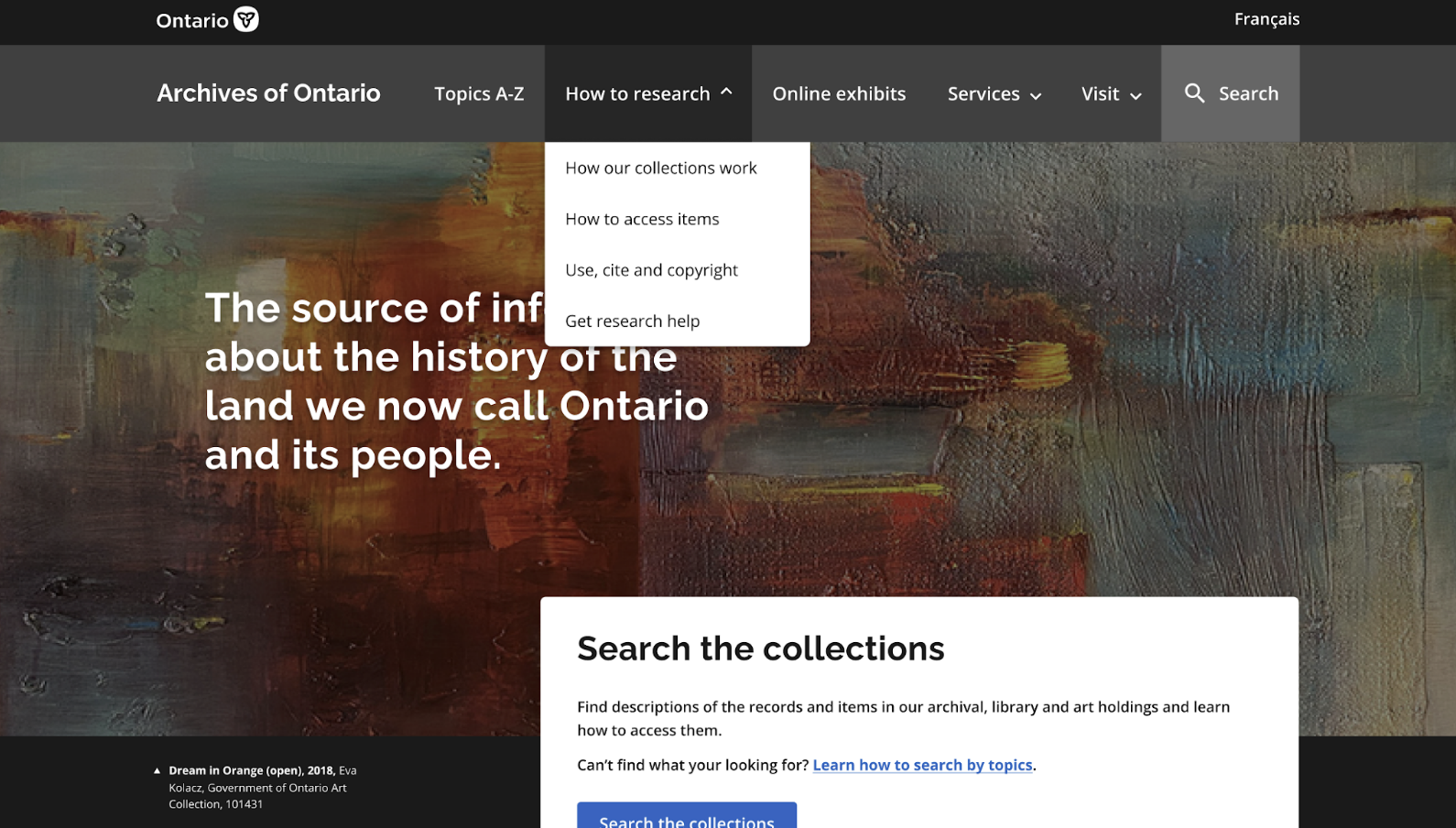
Redesigning the archival research experience by improving visbility and accessibility of documents, simplifying workflows, and creating a user-friendly online platform: www.archives.gov.on.ca
Sector
Government Archives
Client
Archives of Ontario (AO), Government of Ontario
Team
Amrita Takhar (UX Lead), Nadia Mariyan Smith (UX Co-op), David Di Medicis (Content Designer)
Tools
Figma, Miro, SharePoint, Zoom, Alchemer
My Role
I conducted discovery research, lead user research recruitment and preperation, facilitated user interviews and usabiltiy testing, analyzed findings, mapped out current processes, and lead the designed and prototyped solutions.
The Archives of Ontario
The Archives of Ontario (AO) is the largest provincial archives in Canada, and the premier source of information about the history of the land of so-called Ontario and its people.
Project Background
The AO aimed to create a more user-friendly website to improve how researchers access and navigate their archival collections.
Through user research activities it was identified that research guide content and data were missing from the information architecture and the designs.
Due to tight timelines, we focused on wills and estates research as it has the most complex data and the most client requests. Our design template could then be used for other research guides.
Discovery Research
In-depth discovery was needed to understand the complex processes and data:
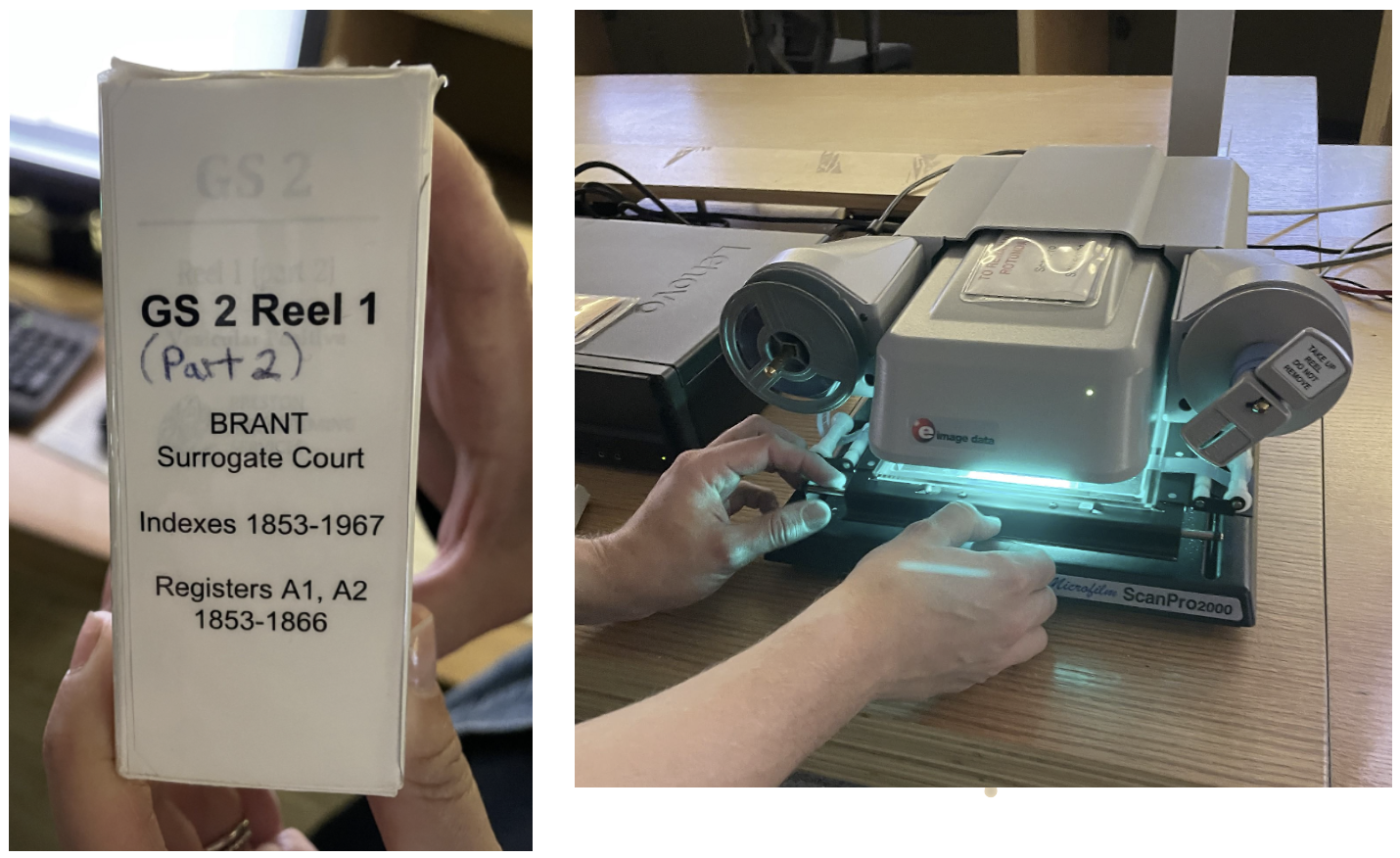
- Archivists walked us through an existing in-person process and then gave us a test to find a will on microfilm.
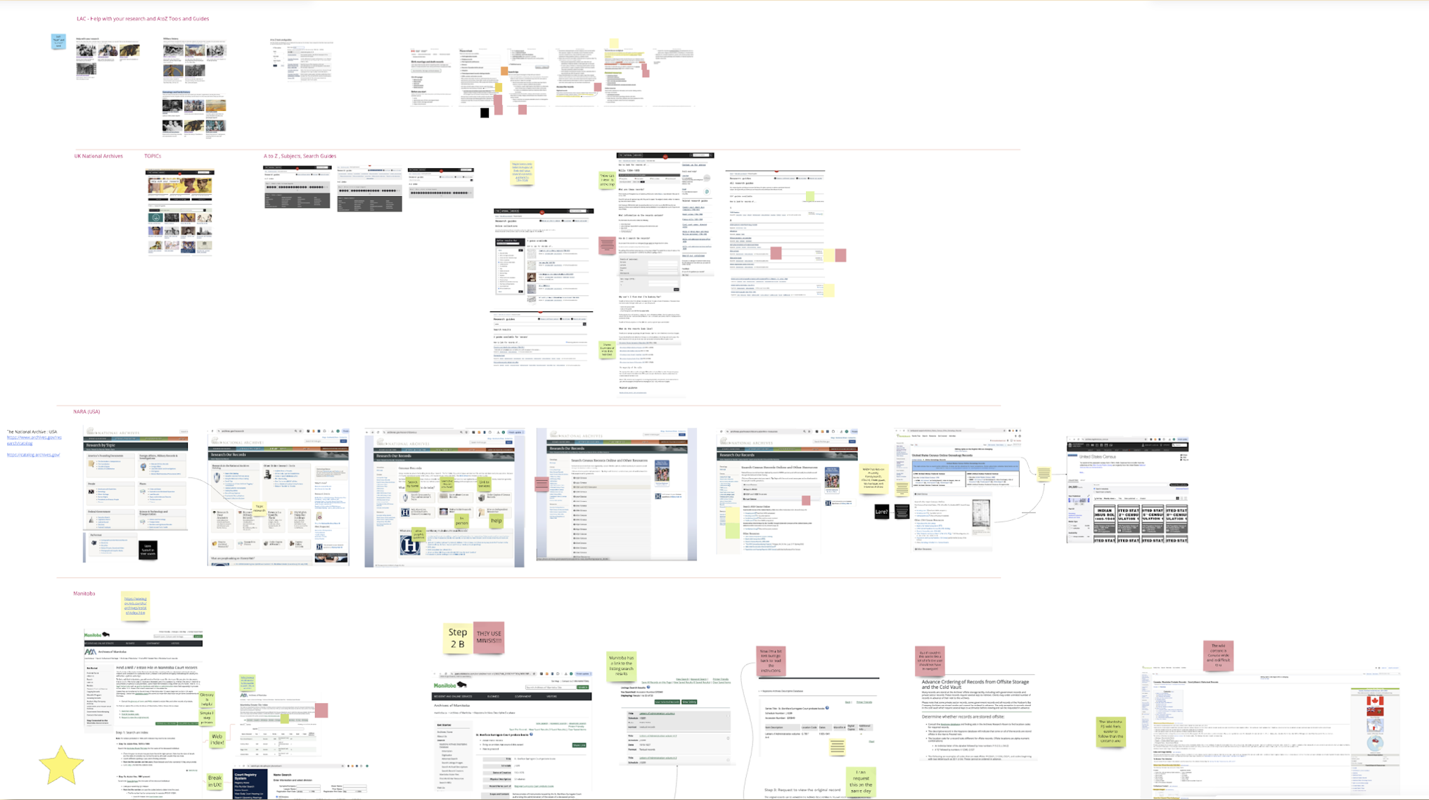
- A comparative analysis helped us understand what was working and not working at 8 other archives.
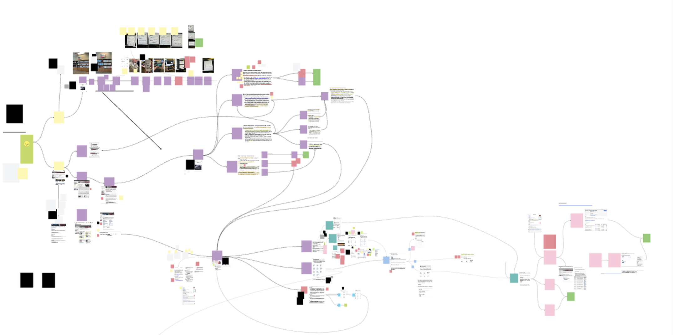
- Mapping made us realize how confusing the existing processes are and helped us see how we could streamline the data.
- We met with a tech chapter developer who helped us understand table opportunities and challenges.
- Design system conversations helped us understand the future of search filters.
- In-person interviews helped us uncover what was working and not working for expert and beginner researchers.
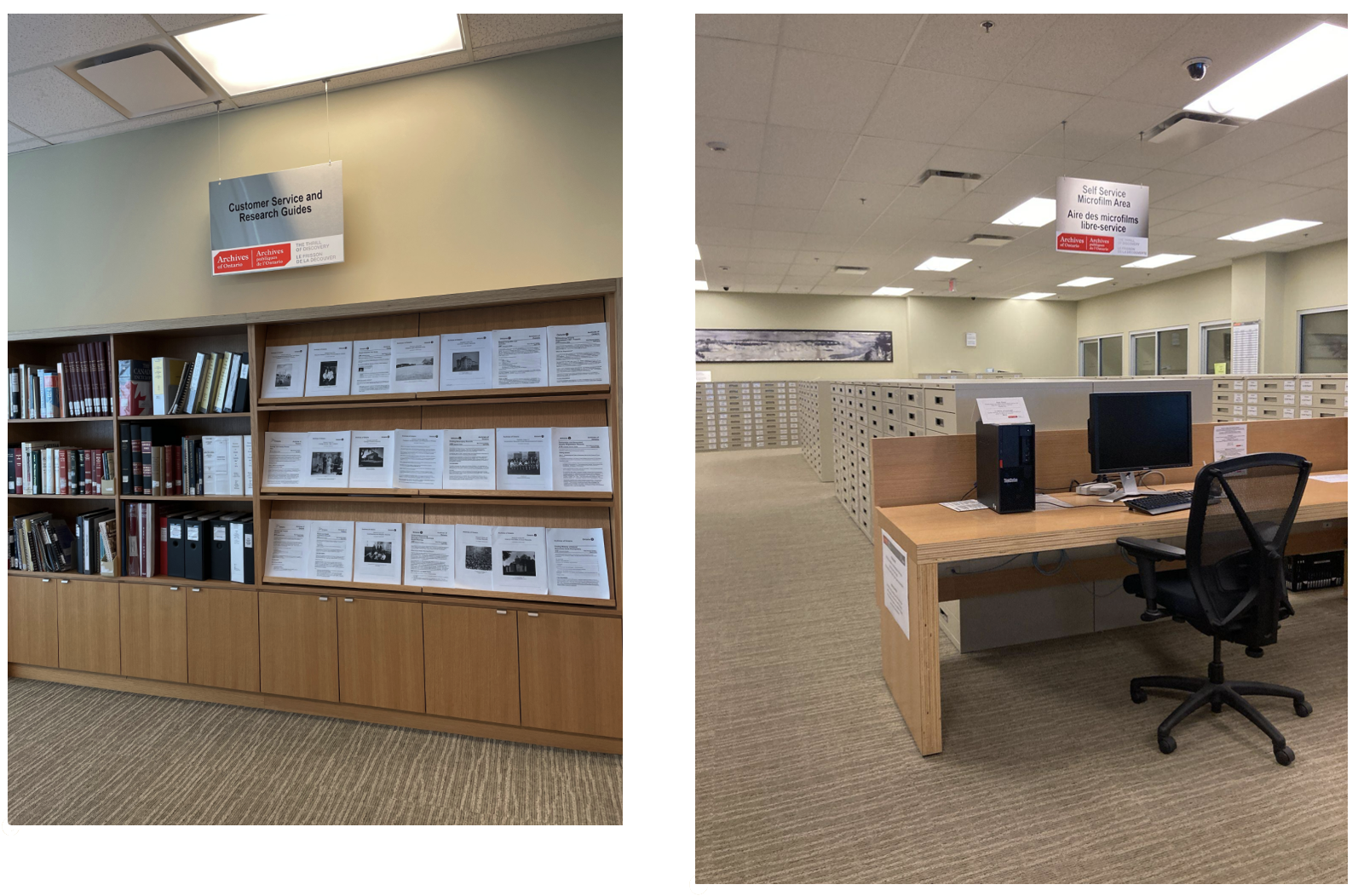
- Our content designer was engaged throughout the first design iteration so they could understand the problem and help us design the initial solution.
Challenges
- The research guides—essential documents that help users locate historical records were only available as PDFs scattered across the website.
- The digitized records are located on an external site that AO has no jurisdiction over the user design of that website.
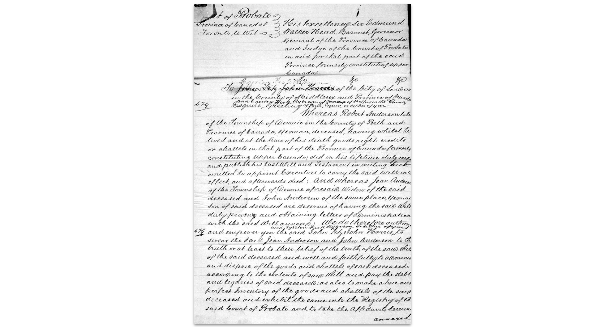
- Few records have been transcribed, therefore a simple Optical Character Recognition (OCR) search bar would not suffice.
- For some records, users faced a confusing two-step process: first finding a record, then locating it in microfilm or digital archives.
- Many researchers did not know that many of the records are available online, which saves them coming in for an in-person visit or spending money on ordering a copy by mail.
- AO staff spend excess time helping users find what they need.
Watch the current process walkthrough video on Vimeo.
Design
We ideated based off of the findings from the discovery research and moved forward with the most impactful X feasible solutions.
Goals of the Prototype
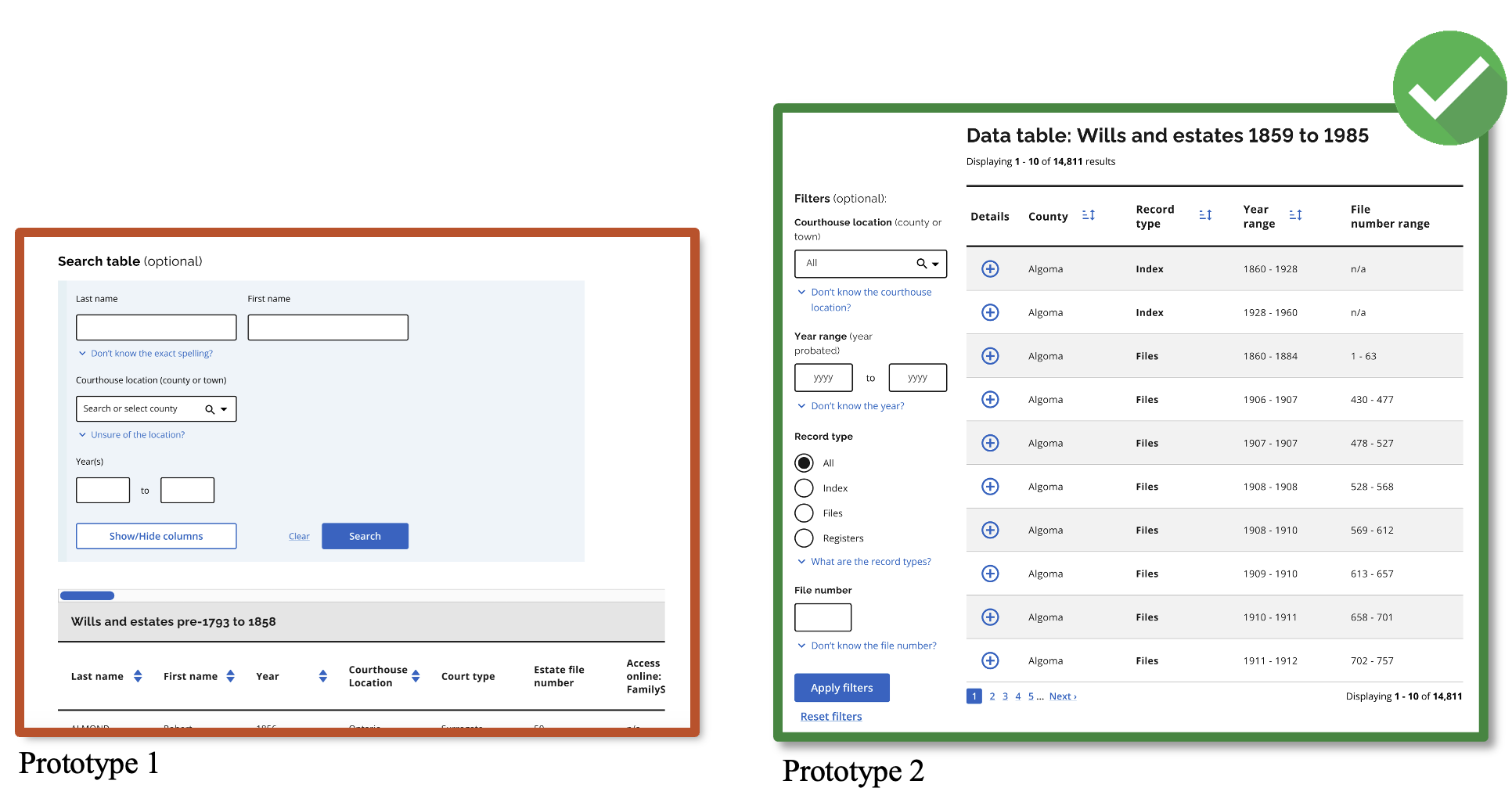
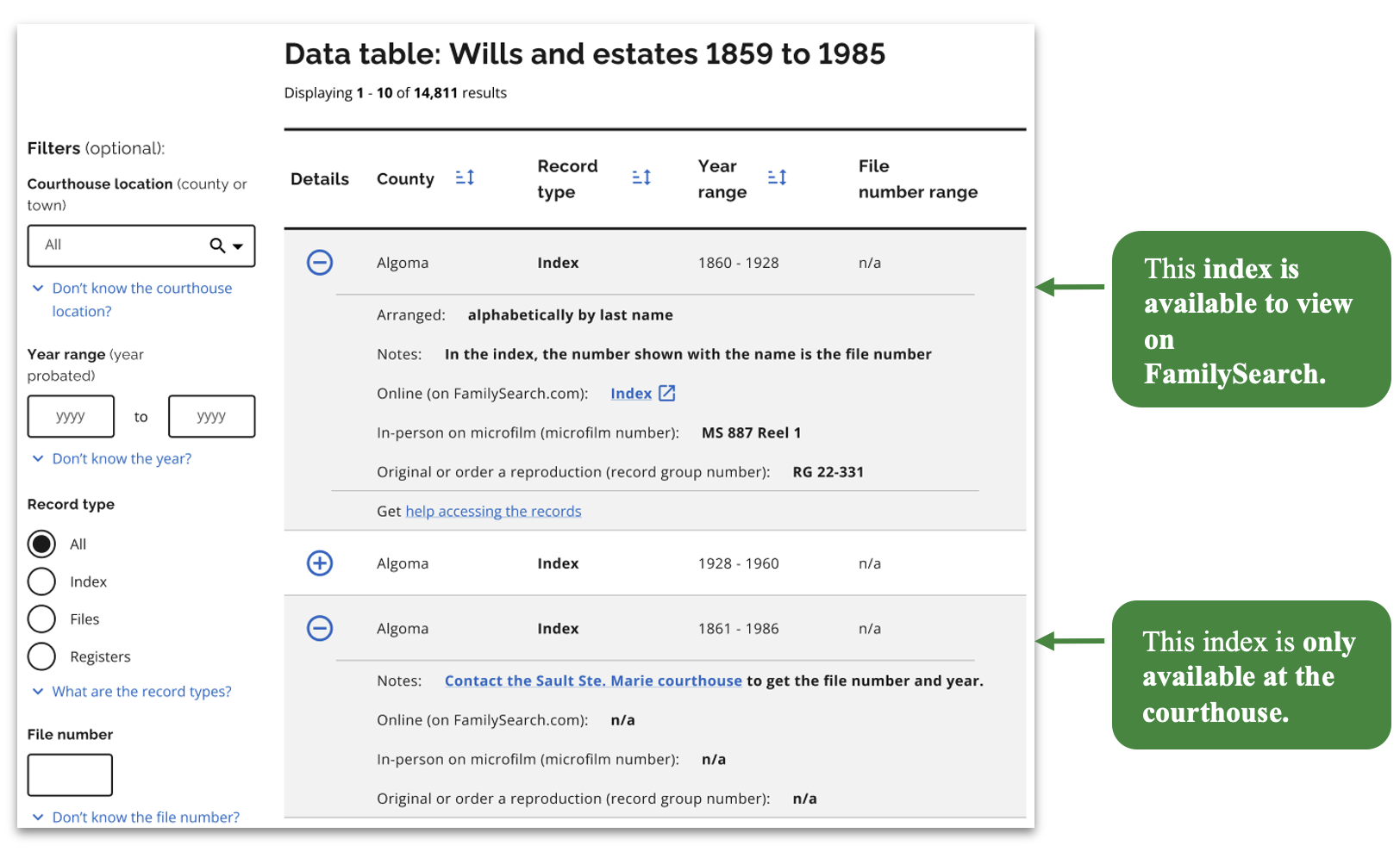
- Combine data tables so that users can obtain all the information about a record in one place (i.e. microfilm number, RG number, and whether the file is available to view online).
- Make research guides easy to find and accessible.
- Use plain language and content best practices.
- Remove unnecessary steps and complex processes.
- Focus on finding the record and then how to access it.
- Create a web template that can be used across the archives ~ 29 topics that have research guides and related data.
Usability Testing
We conducted two usability testing rounds to iteratively revise the design.
On our second round of testing we had to pivot mid-testing when our solutions were not working and make further revisions.
Key takeaways
- Accordions proved effective.
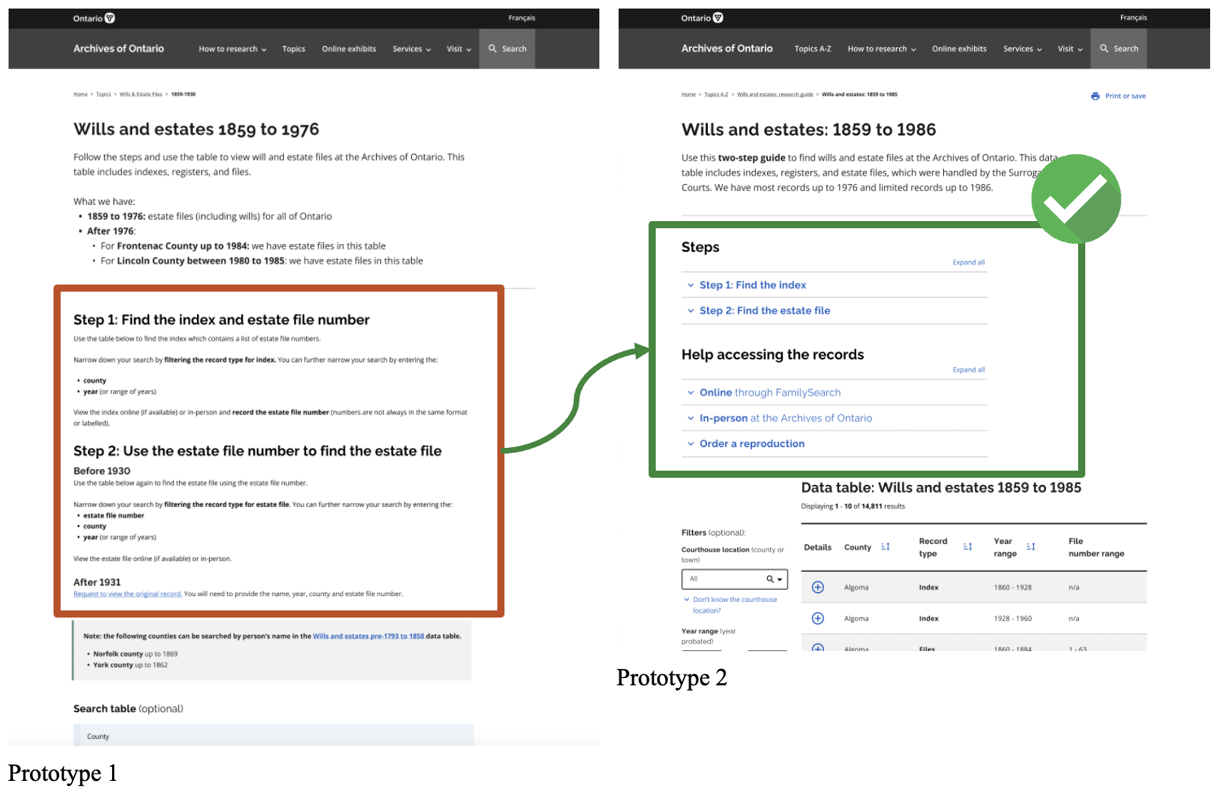
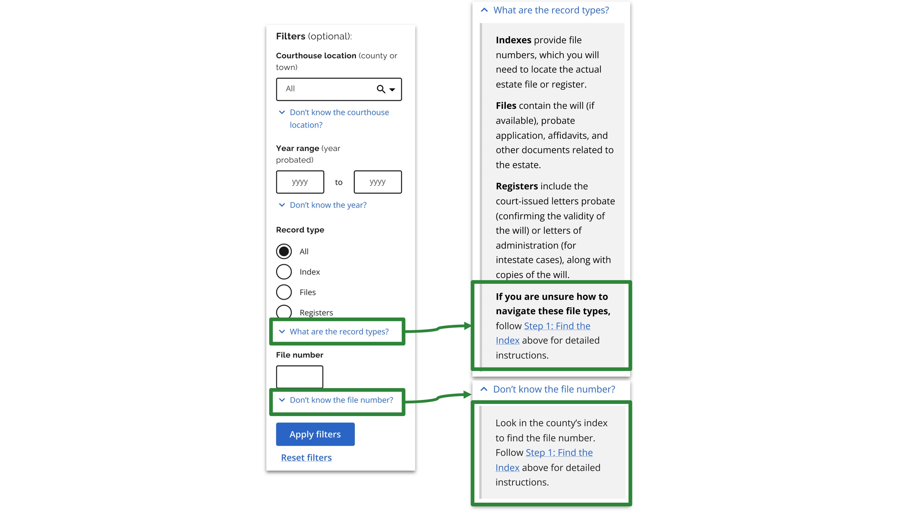
- Instructions in the hint text helped participants in the moment.
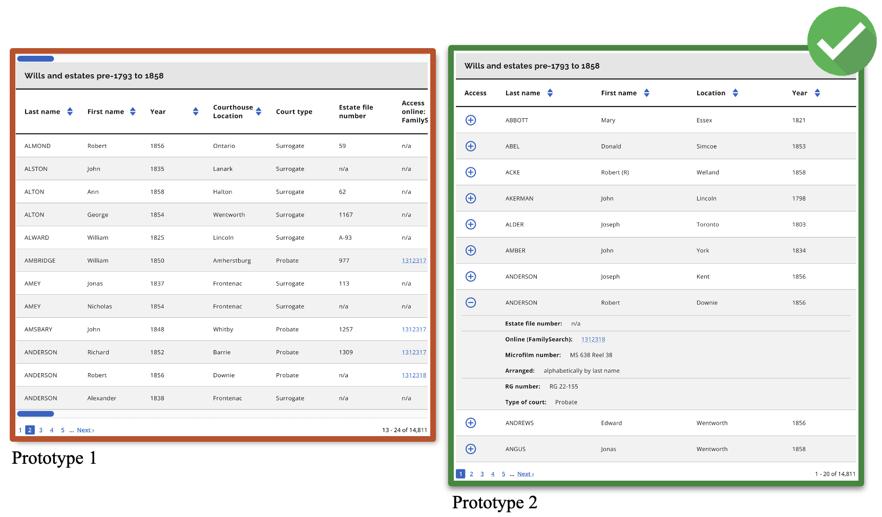
- Accordion tables were preferred over side-scrolling tables.
- Moving the table filters to the left increased discoverability.
- Tables brought together all data and exceptions. We expanded them to include notes to assist the user.
Final Design
Watch our final proposed design video on Vimeo.
Limitations
- We could not fix FamilySearch and could not address historical record keeping issues.
- We attempted to assist users as best we could with content.
- We could not resolve the 2-step process due to the nature of the records. But we made the instructions more visible and digestible.
Ideal scenario
To truly make the records easy to find and use, the data would need to be digitized
and searchable.
Takeaways
- Place information where and when users need it: During usability testing, I saw how easily users missed important guidance when it was tucked away or shown too early in their journey. I learned to align information placement with users’ mental models and real-time needs, surfacing help at just the right moment, in just the right place.
- UX can’t always solve all the problems: Some of the barriers users faced were rooted in larger system constraints. This reminded me that UX design is most powerful when paired with advocacy, policy changes, and cross-functional collaboration.
- Usability testing scenarios can’t always reflect the actual experience: No matter how carefully a task is designed, simulated tests in a controlled environment can’t fully capture the complexity of real-world use. I’ve learned to balance what I observe in testing with the broader context of how and where people actually interact with a service.
Thank you for reading!
